
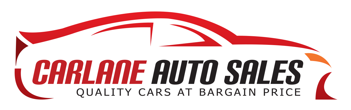
This is a logo revision for a buy and sell car business. The owner wanted the words in the logo to be the main visual instead of having a separate object as "the logo"/visual itself.
I retained the original colors as per client instructions, and also, there isn't anything visually wrong with it. The client also wanted the "L" too look like a road or vehicle lane to match the word in the logo. Added speed lines and made the letters lean a certain way to convey the speed of vehicles in the fast lane.
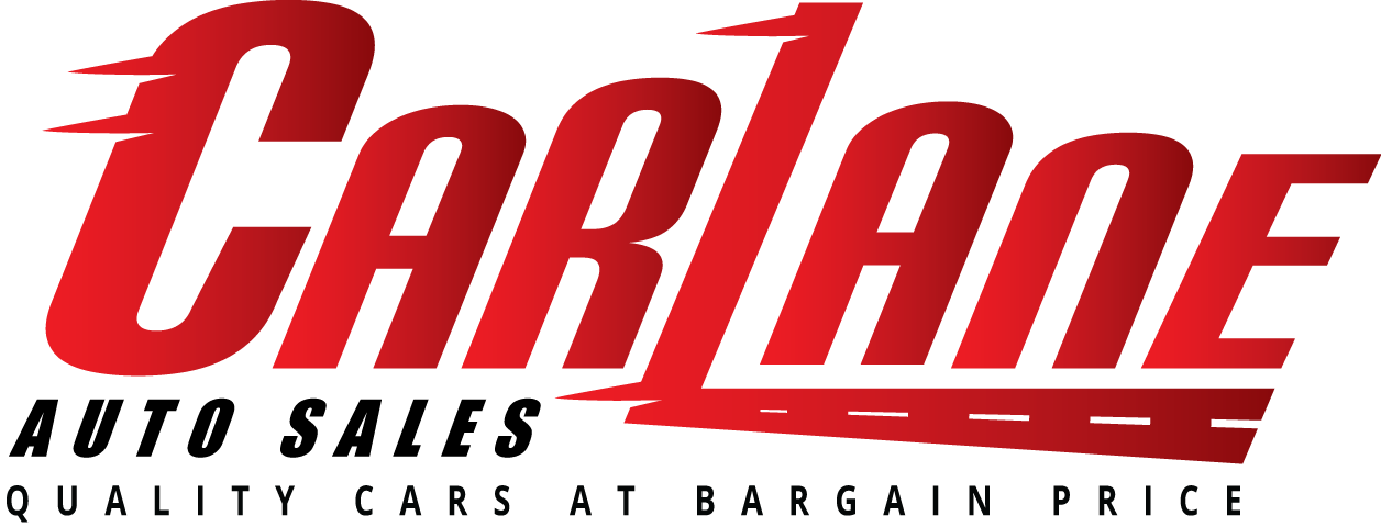
This is the previous logo that the client wanted to change.